Right... where to begin. Erm... there was no "one last thing!"
 Time Machine
Pretty kool. Pretty suave. Pretty, pretty. In terms of looks it's quite amazing, stunning even, and it's implementation is quite spectacular too. The idea behind it is great. Keep constant snapshots of your system and jump back to files when you suddenly realise you really shouldn't have trashed them. Apple are very right in that very few people back up... I don't... and certainly a solution is needed. But, I wonder about the finer points. It seems you need a massive external hard drive, which is just not practical for a portable user like myself. And even for Apple, Time Machine is completely over the top. Do we really need a whole new space just to restore files in? I mean, it's kool, but
so OTT. I don't even think I'd make much use of it. I'm pretty careful with my files, and I certainly can't see myself using it often enough for it to warrant a place on my dock.
 Mail
MailMore eye-candy with the stationary. And haven't Windows' users had this sort of thing for ages in Outlook Express? Okay, so Outlook doesn't implement it just as nicely, but still, it feels like Apple are desperately trying to make sure that they can do every single last thing that Windows can. I always thought Mail didn't have any stationary because Apple considered it childish and unprofessional. I'm not an aficionado of this sort of thing, I want my email to get straight to the point and avoid any superfluous HTML.
Notes sounds damn useful. I need a place where I can make notes, and Mail is the perfect place for that. I've tried third-party note-taking apps, but they jus' don't feel right to me. Notes in Mail does feel right, and my Inbox is a good place to store this sort of thing. I don't really use To-dos so much, I guess I just don't have enough things to do, but for a certain user I can see this being useful.
 iChat
iChatYet more eye-candy, can you believe it. The only serious new features are tabs and photo/keynote sharing. The video backdrops are pretty kool, and I guess you could have some fun with the Photo Booth effects, but I would have much preferred Apple to address more important issues like the fact that iChat can't talk to half the world's IM users. Seamless support for the MSN and Yahoo! protocols would have been much more impressive.
 Spaces
Oo... I like this one. The idea of multiple desktops is pretty kool. I first came across them in
my flirtation with Ubuntu (apparently Linux has had them for ages). The premise is simple, instead of having all your apps cluttered together you have separate 'spaces' or desktops to group certain apps together. Having a separate space for Photoshop, for example, would be heaven. Then I could maybe keep a space for my IM chats and Mail. A space for Safari. And then a space for whatever project I'm working on. It really would solve a lot of my desktop clutter issues, and along with a higher screen resolution I would be flying.
Along with Time Machine, Spaces gets its own icon on the dock. I'm not sure I like this. I don't like the way Apple is putting a lot of system-wide stuff, Dashboard included, into the dock. It doesn't feel like the natural place for it to reside. Time Machine should go in the Apple menu. Spaces should be just a keystroke, although which keys is beyond me. In fact I don't think I'd need to move from space to space manually, instead I'd rather use Exposé to jump around between spaces, by clicking an app within that space. I do hope Leopard's iteration of Exposé is Spaces-wide rather than separate Exposés specific to each space.
 Dashboard
I'm not sure how advanced an environment Dashcode is, Apple clams you can make Widgets without writing any code. So is Dashcode really aimed at developers or more at average Joe? I've never even attempted to create a Widget, but it doesn't seem all that hard, but regardless I imagine Dashcode will be a welcome addition to Apple's developer tools.
Web Clip seems pretty awesome. I can see a use for that. Often there's a little piece of a website which you want to keep an eye on, and Web Clip is just right for this job. And it seems extremely easy and quick to use.
 Spotlight
Not much to say really... I like this idea of Spotlight showing your recent apps and documents or whatever... that's useful. Searching other Macs has no impact on me at all, since I only have one Mac, and don't plan on ever owning more than one at any one time. In fact, the idea of using more than one computer on a regular basis is horrible. I hated using the computers at school, not least because they were Windows machines, but because I've made myself at home in my iBook, everything's how I want it to be. For the foreseeable future I plan on only ever owning one Mac portable at a time, and thus I have no use for multi-Mac search.
Quick Look seems handy I guess, but it should have been there a while ago.
I use
iCal, but would have no use for the new features Leopard introduces - I'm just not a busy enough guy. A lot of people seem joyous about the CalDAV support though.
The new VoiceOver voice Alex is pretty sweet, but again, not really much use to me. Although it has occurred to me that I could use VoiceOver to read back my writing, which should make proofing a bit easier. It's good to see Apple doing things for
Accessibility though.
64-bit: didn't we get this in Tiger? Apparently not fully. 64-bit was only at the Unix level and didn't actually affect Mac apps. Now it does. Not that it will effect me for a long time since only the Intel Xeon chip is 64-bit. I doubt any Mac I buy in the next few years is going to be 64-bit, and I don't care too much... the most intensive stuff I do is in Photoshop, and we probably won't get a 64-bit app from Adobe until at least CS6.
With
Core-animation we look set to see an explosion in the amount of eye-candy in future apps. Whether that's a good thing or not is debatable, but still, that iTunes artwork screen saver is pretty swanky.
So
Leopard's features are nice, but nice isn't super. For me the most exciting new announced feature is
Spaces. I can see it changing the way I use my Mac. I think it'll allow me to start keeping loads of windows open (and therefore more easily accessible), without having to worry about wading through apps irrelevant to what I'm currently doing. Otherwise Leopard (as it stands) is pretty boring... but let us not forget what Steve Jobs said: The most exciting new stuff is top secret so that the folks in Redmond won't get a leg up before they have to.
Overall though the keynote was disappointing. And there was definitely a feeling of Leopard isn't anywhere near ready yet. It's a shame to hear it's being set back to Spring '07, although, that'll quite possibly be before Vista. It also feels like Apple have run out of steam as regards innovation. Everything announced was kind of old news, even the only hardware announcement, the
Mac Pro, was predictable. That said, Jobs is holding back on us, how innovative this unannounced stuff will be is yet to be seen... but remains exciting.
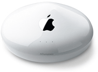 So those pesky AirTunes drop outs just got too much and I shelled out for an AirPort Extreme.
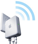 Cut outs in AirTunes are quite possibly the most irritating thing God ever created in the entire universe. I hate them. I want them to stop.... ahhhh... one just happened right there now!
 Safari got me into RSS a good year ago, and now I wonder how I ever lived without the beast. Having the news come to me makes life that bit easier and for a change in my life I feel like I'm up to date, and I don't even have to try.


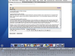
 So Monday sees my first ever
 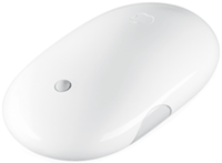 Hot on the heels of my "The mightiest mouse" post, Apple have brought out the